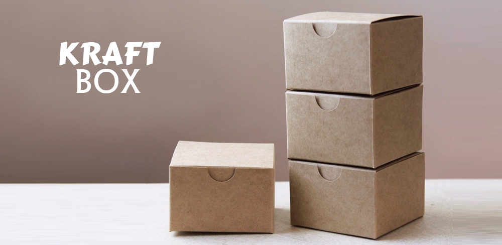
Anyone who has worked with kraft packaging has probably come across the challenge of creating a design for kraft boxes. It can be tough to fit so much text, graphics, and artwork into such a small area. But the outcome is worth it! By using a suitable color scheme and box design principles, you can create a visually appealing package that your customers will want to purchase. Here are some great tips on how to use color in kraft material boxes:
1. Create a good base color for your kraft box
To create a good base color, you need to consider your company’s brand and target audience. The best colors will be those that represent your brand effectively. For example, if you are a family-friendly food company, green is a great color because it is associated with nature and the outdoors. The best colors for kraft packaging are neutral colors, such as white and black. This can help with brand recognition and visibility. The best way to ensure that your box colors meet the standards of your brand is to test a variety of options. You can start with an online color palette or draw inspiration from other brands. You can also use a box mock-up application to understand better how your boxes will look.
Make sure that your base color is easily legible and does not bleed when you print them on a piece of cardboard. An excellent way to ensure that your base color is easy to read is to test it on different backgrounds, such as white walls. This will ensure that your brand is easily visible whenever someone receives your boxes.
2. Use text to anchor the design
Text is the key element to a successful custom kraft box design. You can use it for all aspects of your design, and it will anchor your design. For example, you can use text as part of your logo, as part of the colors in your design, or as the background color on images. Since most of the design will be text, the text must be easy to read and not distract from the overall message. For example, if you use a color scheme with lots of colors, use black text to anchor your design.
Easiest color to read, and it works well with any design, no matter the theme. Remember that black text on a white background will look lighter than the actual color. Lastly, make sure your design works on different sizes, from small social media posts to large ad campaigns. Finally, if you are designing a box for a specific event, ensure that your colors complement the event’s overall theme and atmosphere.
3. Stay away from complimentary solid colors
While complementary colors work well as a design element, they can be jarring in a kraft paper box. This is especially true when you need lots of text or graphics on the package. When using complementary colors in your design, avoid bright red, green, and yellow. These intense colors create a jarring effect. The most common complementary colors for a kraft material box are blue and green. These colors can make some solid, eye-catching designs. However, these colors can also look a bit overwhelming. Therefore, darker shades of these colors are usually preferable to lighter shades because they will lend more drama and depth to your design.
While these colors are widely considered safe, they are best avoided when designing a kraft paper box. These colors can create a robust and jarring effect that may distract from your text or graphics and make your design look sloppy. When using these colors in your box design, try to focus on the main elements of your design.
4. Be mindful of your accent color
Your accent color creates contrast with other colors in the design. Use an accent color for callouts and copy, but not for every design element. One of the first things to consider when working with color in your kraft boxes wholesale is your accent color. These boxes are typically white, but if you have a strong brand and want to emphasize it, you can use a different color for an accent.
You can even use a secondary brand color. For example, if your brand is green, you can use yellow boxes as an accent. This will draw the eye to your brand and give a pop of color to the design. Keep in mind that you can use only 15% of the space. Please select an intense color that draws attention, but make sure it does not overpower the other elements in the design.
5. Experiment with your kraft box palette
So, experiment with your palette and use different colors in different parts of your box. To go with a specific color scheme, make sure you keep it consistent throughout the design of your box. For example, if you are designing packaging for a new product launch, you might want to use colors like green and blue. Keep those colors in the background of your design and use them as highlighters instead of using them everywhere on the package.
The best color schemes will change as you learn more about your audience. So experiment with your palette and try out new colors now and then. Once you have a few tried-and-true combinations, you can start using them in all of your packagings.
Conclusion
To say it bluntly and from a legal perspective. The five best color schemes for a Kraft box are: – Black & White – Green & Blue – Red & Brown – Purple & Gray – Yellow & Orange. To mix and match hues for the embellishment of your product packaging. Hard and fast rule to stick with any particular limit. However, the tips given can give you a better idea of directing your creativity.


